Quick category insights
Every category has its own Spending overview: a forecast of how its money is being used up this month, a comparison with last month and its recent transactions. It helps you spot early whether a category will last until the end of the month.
Open a category's spending overview
- On the Budget tab, tap the category. Its sheet opens with the keypad.
- Tap the View transactions icon (a dollar sign with a clock) at the top of the sheet.
The Spending overview opens with the category's name at the top.
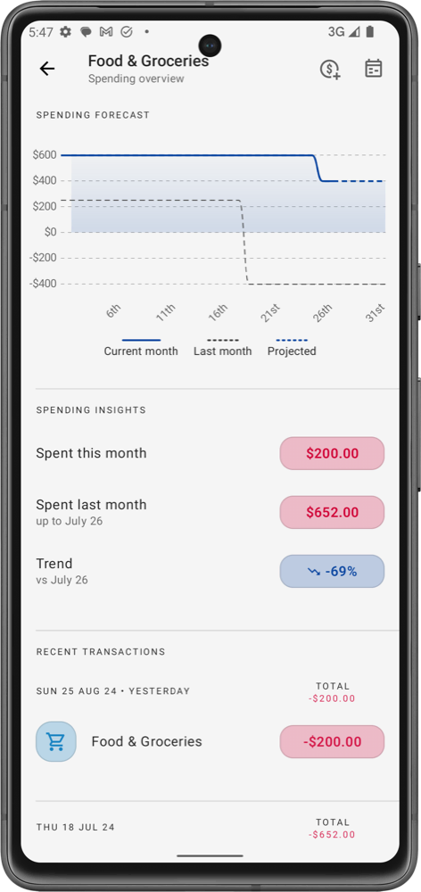
What you'll see
Spending forecast
A line chart of the money available in the category through the month: what you allocated plus any carry-over, going down as you spend.
- Current month: the category's balance so far this month, up to today.
- Last month: the same line for last month, to compare your pace.
- Projected: where the balance is heading for the rest of the month, based on your spending history and upcoming transactions. While the app doesn't have enough history yet, the legend says Projected (Learning).
If the category has subcategories, the header reads Spending Forecast (including subcategories).
Spending insights
- Spent this month: how much you've spent in the category this month.
- Spent last month: how much you'd spent last month up to the same day, so you compare like with like.
- Trend: the percentage change between the two. Spending less than last month by this point shows as a drop.
- Spending comparison: opens the Spending comparison report for this category.
- Allocation history: every allocation change for this category. See Allocation history.
- Recent spending by tag: how the category's spending splits across your tags, with a period filter. Tap View all to see every tag.
- Subcategory allocations and Subcategory spending pie charts, and View combined transactions (from parent category and subcategories), when the category has subcategories.
- Upcoming transactions and Recent transactions in the category.
The icons at the top let you add a transaction to this category (see Quick category transaction) or open it in the Transactions calendar.
You can also open a category's Spending overview by swiping right on it in the targets list.
Historical allocation vs spending
For the longer view, open the category's Category details: tap the category on the Budget tab, then the gear icon at the top of the sheet. Scroll down to find:
- Spending forecast: the same chart as above.
- Historical allocation vs spending: a line chart with one point per month showing what you Allocated and what you Spent in this category, from the first month with activity up to now. Where the spending line rises above the allocation line, the category regularly needs more money than you give it. For income categories the chart is called Historical allocation and shows allocations only.
- Average daily spending for This month and last month, and the Allocated and Spent totals for Last month and All time.
Free and Pro
Spent this month, the Spending forecast and your recent transactions are free.
These are part of Pro:
- Spent last month, Trend, Average daily spending and the All time totals (category insights). On the Free plan they show a lock; tap one to see what Pro includes.
- The Historical allocation vs spending chart. On the Free plan it shows sample data behind a lock.
- Allocation history, which shows a limited number of entries on the Free plan.